

A convenient way for members at Crossroads Bible Church
to stay connected, watch content, find events and more.
Available for download on mobile devices:
*This case study may not reflect the current status of the app.


I led a redesign project at Crossroads Bible Church with the goal of redesigning their mobile app based on user research. CBC has many online resources that its community needs easy access to on the go, but their previous mobile app lacked intentional design and was confusing. I was hired to remake the app with intentionally tailored solutions for everyone.
The final designs of this project were limited to what I could make in an app building tool called Subsplash, which the church needed me to use. Limitations or not though, the final product still proved impactful!
UX Designer
UX Researcher
June - Dec 2023
Figma
Photoshop
Subsplash
Google Forms
I wanted user input to be the foundation of my design, so that's where I began. I held interviews with five people from a variety of groups and demographics at CBC to understand what people expected from the app and where they were encountering frustrations. To do this, I had each interviewee complete a few tasks in the app while I observed them, then we talked about their thoughts.


To supplement my interview data, I created a survey that I distributed through emailing lists and with signs around the church. The goal of my survey was to discover how the app ranked among various other communication channels and what people expected from the app.


*It is important to note that the survey was also used by the communications team at CBC to guide decisions regarding communication effort changes, which meant that the survey was made to serve both of our needs. While this did mean that much of the survey had to be tailored to other needs before my own, the survey turned out to be valuable to both of our projects!
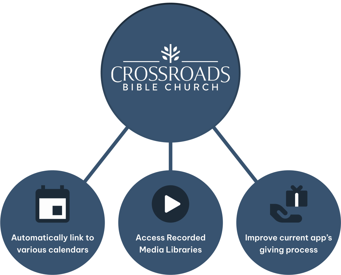
I also had a meeting with the leadership of the communications team to ensure that I was meeting the church's needs with my design. We determined that the mobile app should be a platform to view events for various ministries and access the church's media library. The church also wanted to improve the current giving process, which was previously just a button that linked to their website.
Based on my user research and some personal exploration of the app, I identified some of the most pressing issues I would need to address:

With my problems defined, I chose to create a flowchart that visualized my intended functions on each page of the app.

I then used my flowchart to create a prototype of the most important pages in the app. I wanted to reimagine the layout of the app outside of Subsplash, the tool I would have to build the app in later. I found Subsplash to be quite limiting through working with it on previous projects, so by prototyping in Figma first, I was able to make a creative design that could be implemented feasibly later.


After I made my prototype, I explored Subsplash to see if I could implement all my features. I also shared my prototype with user testers and the communications team for feedback. Around this time, my attention was needed to complete other large projects for the church. With only a few hours at most to dedicate to the mobile app each week, the processes of revising and developing designs became mixed. However, I was dilligent in getting feedback at every step and working my hardest to keep users involved in the process!

My final designs were quite different from my original prototypes because of the limitations I faced in Subsplash, but I didn't let them stop me! Some of my changes were as simple as renaming tabs, while others required unconventional methods to implement, but the new mobile app proved itself to be much more useful and popular with the community.

I used CBC's colors and logo to their fullest, resulting in a recognizable and pleasing home page.
By putting important features directly on the page, users saved time and could find info with just a glance.

"Ministries" was easaier to understand than "CBC Hub" for users, and better described the content than "Community".
Users did not find the original buttons on this page confusing, so I left them alone.

Important elements were moved to the top, like calendars. Similar sections were put together to save space as well.
Each page was made similar to its website counterpart for familiarity, but designed in a mobile-friendly way.

Subsplash offered a messages preset that answered everyone's needs, so I utilized it to save time.
Recent media is displayed at the top, as well as details on all media and series, making browsing easier.

I found that embedding the giving portal meant the app would have to register specially, which was a lengthy process.
I chose to redesign the original page, making use of space and including more details lower on the page.
After releasing a finished design to the public, I collected data on the app's performance through Subsplash's analytics service. The graphs below show how often the app was used and downloaded in 2023. I began working on the app in June, released the first working version in August, and periodically updated the app throughout my time at CBC, which ended at the end of December.


Below are posters and signs that were used to spread awareness for the surveys and redesigned app respectively, all of which I designed as well.


Working at CBC taught me how ambiguous and fluid the design process can be, especially in an environment where I had dozens of other responsibilities at once. I learned to make progress with very limited time and resources, as well as how to be comfortable working in a process that felt unstructured at times. Truthfully, it wasn't necessarily unstructured, and I gained a new perspective building a design process with a structure as fluid as my schedule.
If I had the chance to continue my work on this project, I would want to establish stronger consistency across pages. This could be achieved by redesigning many assets, including buttons on the ministries page and the messages page. I also added other features that users and CBC requested, such as a prayer request form, that were somewhat rushed due to time constraints near the end of my time at CBC. I think that running user tests and experimenting with Subsplash to find the best ways to implement these features would be incredibly useful.
My time at CBC was filled with learning and growth, and I am so grateful for the chance to have worked with such an amazing community! Having been at CBC since my childhood, it feels amazing having an opportunity to give back in a unique way, and I intend to keep serving the community however I can!


